This follows on from: Generative AI for Genealogy – Part XVII
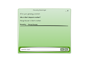
Building a Research Agent
There comes a point in every genealogist’s life when you realise that asking questions about the ancestors you’ve spent decades researching is… well… lovely, but also a bit like talking to your favourite houseplants. Comforting, familiar, and unlikely to surprise you.
But what about the other people? The ones you haven’t researched yet? The ones lurking in the shadows of the 19th century, quietly judging your lack of curiosity?
That’s where the real work begins. Genealogists spend an astonishing amount of time trawling for these mystery individuals. Modern tools like Ancestry make this almost too easy — to the point where the challenge (and therefore half the fun) evaporates. And when the challenge evaporates, mistakes creep in. My personal favourite: attaching a death record to someone who later turns up getting married.
It’s the genealogical equivalent of declaring someone dead because they didn’t answer your text.
One of the most beloved free (genealogy) tools in the UK is FreeBMD: https://www.freebmd.org.uk (EXTERNAL)
This heroic database contains 298,510,339 distinct records, all painstakingly transcribed by volunteers who donated their evenings, weekends, and presumably a portion of their sanity to digitising the indexes. Truly: thank you, whoever you are. You’ve saved us all countless hours of squinting at microfiche.
And while the aesthetics of the site don’t exactly spark joy, I also want to thank the developers. It’s been incredibly useful, and it’s clearly a labour of love.
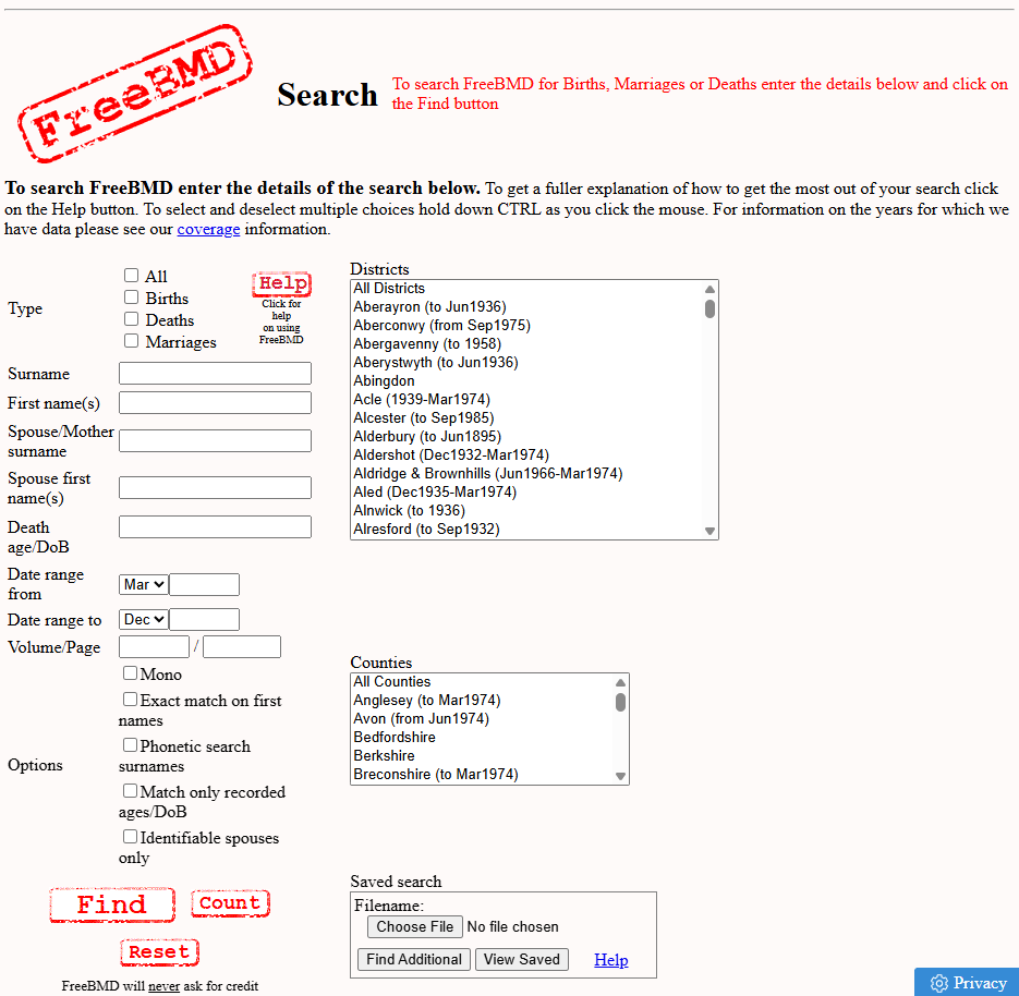
Why screenshot it?
Because I know what’s coming next.
And it’s… this:
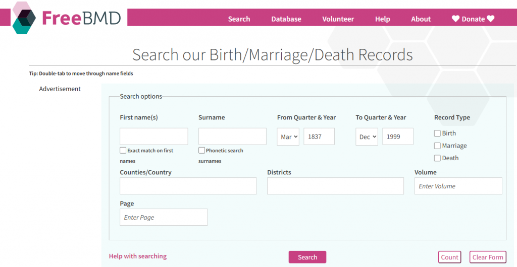
I wish I liked it more. I really do. I’m not sure whether this says more about the redesign or about me — a man who has strong feelings about form layouts, but here we are.
A Few Observations (Said With Love)
Functionality
- The mysterious extra “names” and “surnames” labels under the input boxes. Are they echoes? Tooltips? Existential reminders?
- “Record Type” — arguably the first thing a user thinks about — is tucked away on the right like it’s been naughty.
- The tab order. Oh, the tab order. I’m sure someone had a reason, but going First name → exact checkbox → surname feels like a small usability prank.
- The search button in the middle. The reset button. The type=”reset” button. I haven’t seen one of those in the wild since the early 2000s.
- And the “count” button. I’m sure someone uses it. I’m just not sure who. Or why. If there’s one John Smith, you still have to search again. If there are 3,000, the number doesn’t help you find yours. It’s like asking, “How many needles are in this haystack?” instead of just looking for the needle.
Aesthetics
- The quarter
<select>is taller than the<input>fields. CSS has had ways to fix this since the era of dial‑up. - Page and volume fields split across lines. If you’re going to use two rows, at least keep the siblings together.
- The font size is large (good), except when it suddenly isn’t (less good).
Best Practice (Or Lack Thereof)
- The page barely fits on my 17″ laptop at 100% zoom. I’m not convinced everyone has a 3000px-wide monitor.
- A 7MB download for a search page with no ads. That’s… a choice.
- jQuery 1.12.4 from 2016. I’m not judging. I’m just… observing. Quietly.
Now — I’m not here to dunk on FreeBMD. Truly. If you’re a QA, dev, or architect, you’ll understand the instinct: you see something, you mentally redesign it, and then you sigh because you know exactly how much work it would take to fix.
But we’re here for the AI/genealogy build, not a UX critique. Let’s get back to the mission.