Choosing a data-set
I wanted something small enough to learn quickly. I chose the 2012 temperatures in Kyiv (Ukraine) from: EXTERNAL link to weather as a .csv file, filtered to just “Kyiv” / “2012”
2012 was a happier time for most of us. It was before the Labour Party got into power (although we had the mop-haired funny man), Taiwan wasn’t being harassed by a country that has never owned it, Russia was a friend and well respected, and Hamas hadn’t caused innocent Palestinians to suffer the wrath of Israel. Maybe it was not such a good year for the US weather-wise.
According to that dataset, the temperatures were:-
private double[] _temperatures = [23.48, 12.30, 34.15, 52.96, 64.58, 67.64, 73.66, 68.59, 60.47, 49.20, 39.55, 22.39];
Requirements
- Create a simple test bed to generate reproducible results each time it runs:
- Enable the user to define the neural network layer sizes so they can experiment to find the optimal size.
- Ensure everything is reproducible by using a predictable pseudo-random number generator, with a UI control to select the seed.
- Ensure multiple instances of the neural network are identical (weightings/biases) to see the effects of different techniques and rule out other factors. Comparing like-for-like isn’t always easy. A prime example is different initial weightings/biases can lead to convergence at a different rate.
- Allow the user to define how many epochs to run the test for.
- Support shuffling batches of training data, with all instances receiving the same ordered data each epoch.
- Training is deemed to be perfect if it is within 0.8F in overall accuracy (sum(error)/# months).
- It must use a well-behaved activation function, for which I’ve picked SELU
- The user experience should be visual, and avoid crunching of data to compare.
Visualisation
If you’ve read my other blog pages, you’ll know I like “visual” things.
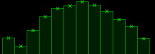
I created a temperature “User Control” to render the temperature graph. Nothing fancy. February appears to be the coldest month, made that bit colder of late by Russia repeatedly targeting thermal power stations…
I created 36 such graphs on a form each with a different learning “optimisation” allowing a direct comparison for each epoch.
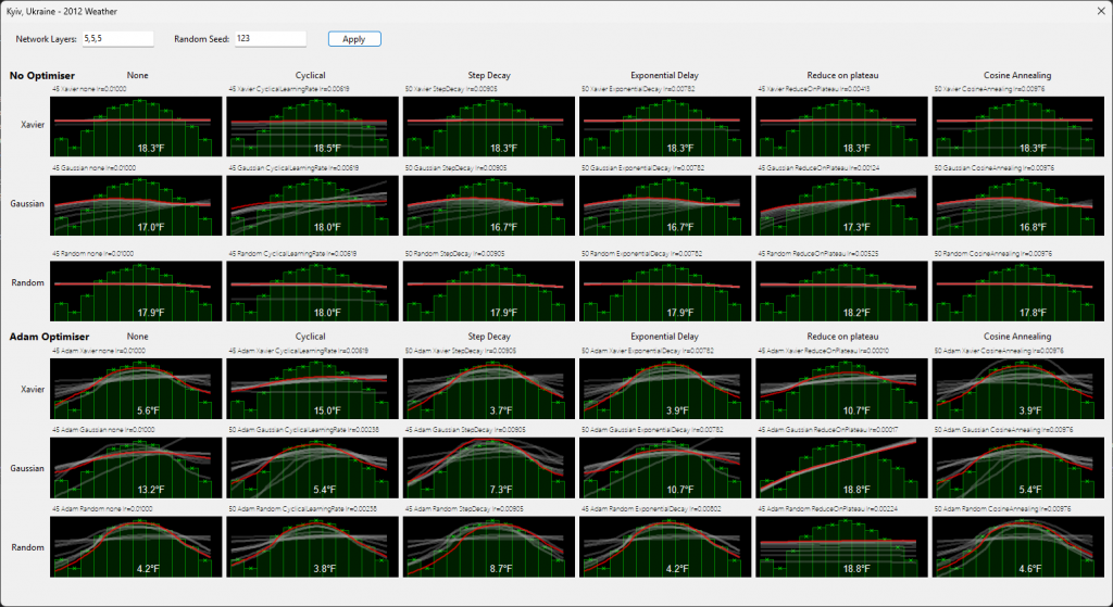
Which is better, and how did ADAM and non-ADAM compare?